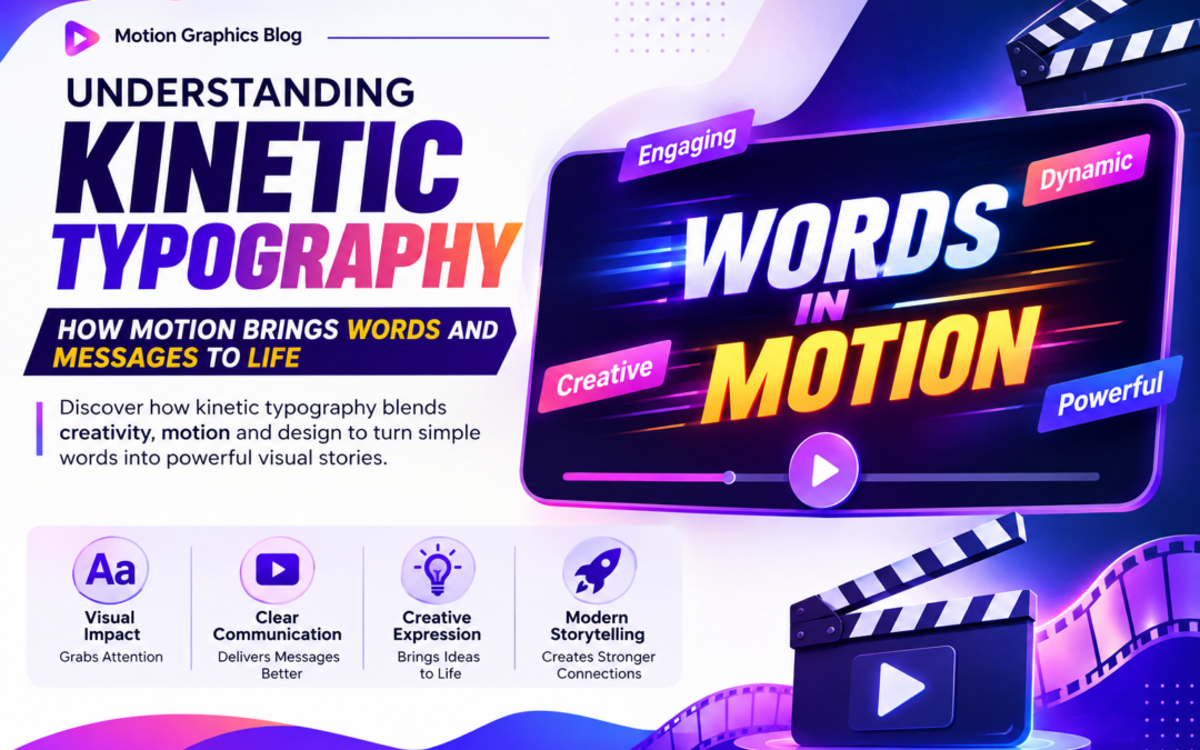
Understanding Kinetic Typography in Motion Graphics: How Motion Brings Words and Messages to Life
Introduction
Have you ever watched a movie title sequence, an advertisement, a social media reel, or a music video where the words themselves seemed to move, dance, and communicate emotions?
Instead of simply displaying text on a screen, designers use motion to make words more engaging, expressive, and memorable. This creative technique is known as Kinetic Typography in Motion Graphics.
In today’s digital world, audiences consume content faster than ever. Capturing attention within the first few seconds is crucial, especially on social media, advertising platforms, and video content. Kinetic typography helps achieve this by transforming ordinary text into visually dynamic communication.
From promotional videos and brand campaigns to explainer animations and film titles, kinetic typography has become one of the most powerful tools in modern motion graphics.
In this blog, we’ll explore what Kinetic Typography in Motion Graphics is, how it works, why it is important, and how it helps designers communicate ideas more effectively.
What Is Kinetic Typography?
Kinetic typography refers to the art of animating text to create movement, emotion, emphasis, and storytelling.
Unlike static text, kinetic typography uses:
- Motion
- Timing
- Scale
- Rotation
- Transitions
- Visual Effects
to bring words and messages to life.
The goal of Kinetic Typography in Motion Graphics is not just to make text move but to make it communicate more effectively.
When used correctly, motion helps reinforce meaning and improve audience engagement.
Why Is Kinetic Typography Important?
People process visual information much faster than plain text.
A moving word naturally attracts attention and can influence how viewers interpret a message.
This is why Kinetic Typography in Motion Graphics has become an essential communication tool.
It helps:
- Capture attention quickly
- Improve message retention
- Strengthen storytelling
- Enhance brand communication
- Create emotional impact
- Increase viewer engagement
In a world filled with content, kinetic typography helps messages stand out.
The Evolution of Typography in Motion Design
Typography has always been a critical part of visual communication.
Traditionally, designers used typography in:
- Posters
- Magazines
- Newspapers
- Packaging
- Branding
As digital media evolved, designers discovered new ways to use movement to enhance communication.
This led to the development of Kinetic Typography in Motion Graphics, where motion became an extension of design itself.
Today, animated typography is everywhere, from streaming platforms to social media campaigns.
How Kinetic Typography Works
Kinetic typography combines design principles with animation techniques.
Designers animate text using:
Position
Words move across the screen.
Scale
Text grows or shrinks to create emphasis.
Rotation
Motion adds energy and visual interest.
Opacity
Text appears and disappears smoothly.
Timing
Animations occur at specific moments to support communication.
The combination of these elements creates impactful Kinetic Typography in Motion Graphics experiences.
Types of Kinetic Typography
There are several styles of kinetic typography used in professional projects.
Motion-Based Typography
Text moves dynamically across the screen.
Expressive Typography
Animation reflects emotions and tone.
Audio-Synchronized Typography
Words move in sync with speech or music.
Narrative Typography
Text supports storytelling through movement.
Each style serves different communication goals while contributing to effective Kinetic Typography in Motion Graphics.
The Role of Timing in Kinetic Typography
Timing is one of the most important aspects of motion design.
Good timing determines:
- When text appears
- How long it remains visible
- How fast it moves
- When it exits the screen
Poor timing can make text difficult to read.
Effective timing ensures viewers can absorb information while maintaining visual interest.
This balance is crucial for successful Kinetic Typography in Motion Graphics.
How Motion Enhances Communication
Motion can completely change how audiences perceive a message.
For example:
A word like “Fast” can move rapidly across the screen.
A word like “Heavy” can fall slowly with weight.
A word like “Explode” can burst into multiple pieces.
These visual actions reinforce the meaning of the text itself.
This is one of the reasons Kinetic Typography in Motion Graphics is such a powerful communication technique.
Kinetic Typography in Advertising
Modern advertising relies heavily on attention-grabbing visuals.
Brands use kinetic typography to:
- Highlight key messages
- Promote products
- Strengthen branding
- Improve recall
- Increase engagement
Many digital advertisements use animated text to deliver information quickly and effectively.
This makes Kinetic Typography in Motion Graphics an important skill for advertising professionals.
Kinetic Typography in Social Media Content
Social media platforms prioritize short-form content.
Users often scroll quickly through feeds and reels.
Animated typography helps creators:
- Capture attention instantly
- Improve content retention
- Increase watch time
- Deliver messages clearly
This is why kinetic typography has become a common feature in:
- Instagram Reels
- YouTube Shorts
- TikTok Videos
- Promotional Content
Kinetic Typography in Film and Entertainment
Film makers and motion designers frequently use kinetic typography in:
- Title Sequences
- Opening Credits
- Promotional Videos
- Music Videos
- Documentary Content
Motion helps establish mood, tone, and visual identity.
Many iconic title sequences rely heavily on Kinetic Typography in Motion Graphics to create memorable viewing experiences.
Principles of Effective Kinetic Typography
Successful motion designers follow several key principles.
Readability
Text must remain easy to read.
Consistency
Animations should support the overall design style.
Purpose
Every movement should have a reason.
Simplicity
Avoid unnecessary complexity.
Visual Hierarchy
Important information should stand out clearly.
Following these principles helps create professional-quality typography animations.
Common Mistakes Beginners Make
Many new designers focus too much on animation and forget communication.
Common mistakes include:
Excessive Movement
Too much motion can distract viewers.
Poor Readability
Text becomes difficult to understand.
Inconsistent Timing
Animations feel unorganized.
Weak Hierarchy
Important information gets lost.
Overusing Effects
Visual clutter reduces impact.
Understanding these mistakes helps improve Kinetic Typography in Motion Graphics projects.
Software Used for Kinetic Typography
Professional motion designers use industry-standard tools to create typography animations.
Popular software includes:
- Adobe After Effects
- Maxon Cinema 4D
- Blender
- Adobe Illustrator
- Adobe Photoshop
These tools help designers create, animate, and refine typography-based motion graphics.
Career Opportunities in Motion Graphics
As video content continues to grow, demand for motion graphics professionals remains strong.
Career options include:
Motion Graphics Designer
Creates animated visual content.
Typography Animator
Specializes in animated text design.
Video Editor
Uses motion graphics to enhance video content.
Brand Designer
Creates animated brand assets.
Creative Director
Leads visual communication projects.
Knowledge of Kinetic Typography in Motion Graphics is valuable across these roles.
Skills Students Should Develop
Students interested in motion graphics should focus on developing:
- Typography Fundamentals
- Motion Design Principles
- Visual Storytelling
- Animation Skills
- Timing and Rhythm
- Design Thinking
- Software Proficiency
These skills help create more effective and engaging typography animations.
The Future of Kinetic Typography
As digital content becomes increasingly interactive, typography animation continues to evolve.
Emerging trends include:
- AI-Assisted Motion Design
- Interactive Typography
- Immersive Experiences
- Virtual Production
- Augmented Reality Content
- Real-Time Motion Graphics
Despite technological changes, the importance of Kinetic Typography in Motion Graphics will continue to grow because communication remains at the heart of design.
Final Thoughts
Words have always been powerful, but motion gives them a new level of impact.
Through movement, timing, and visual storytelling, Kinetic Typography in Motion Graphics transforms simple text into engaging experiences that capture attention and communicate ideas effectively.
Whether used in advertising, film making, social media, or digital content creation, kinetic typography helps designers create stronger connections with audiences.
For students pursuing a career in Motion Graphics, mastering kinetic typography is an essential step toward becoming a skilled visual communicator and motion designer.
Recent Comments