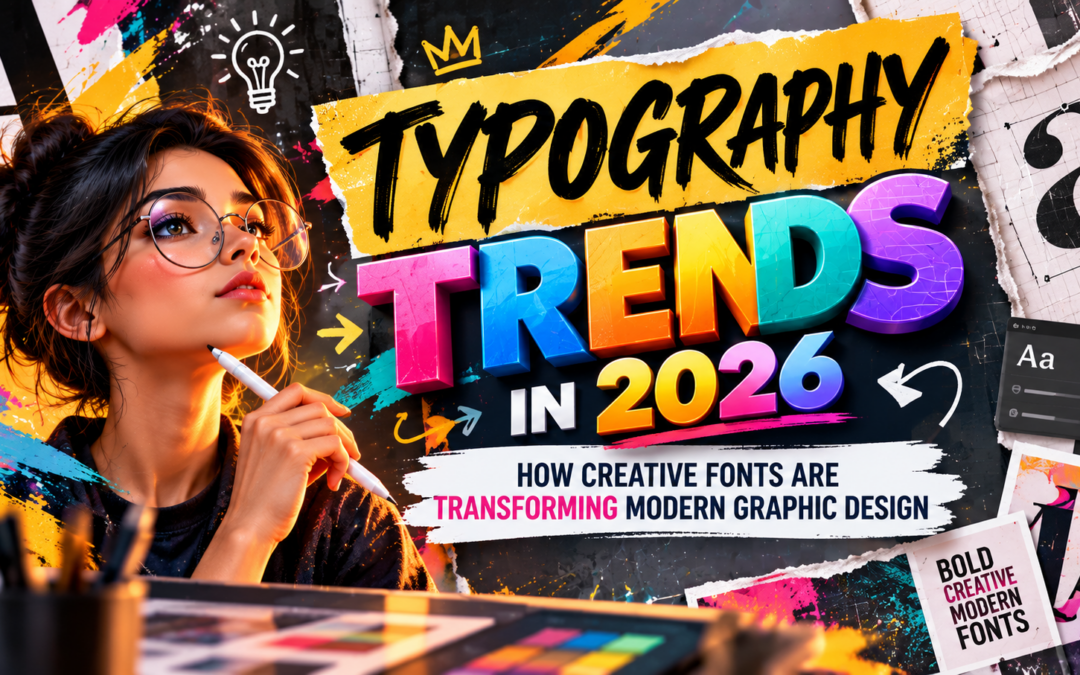
Typography Trends in 2026: How Creative Fonts Are Transforming Modern Graphic Design
Typography is no longer just about choosing a font and arranging words on a page. It has become a powerful visual language that helps brands communicate personality, express emotion, attract attention, and create memorable experiences.
In 2026, designers are exploring expressive lettering, oversized headlines, variable fonts, kinetic typography, textured letters, and creative combinations of traditional and modern typefaces. Adobe’s 2026 creative trends forecast also highlights playful, exaggerated lettering and sensory-rich visual experiences as important directions in design.
Adobe
Understanding the latest Typography Trends in 2026 can help aspiring graphic designers create more engaging posters, brand identities, packaging, websites, advertisements, and social media graphics.
Whether you are a design student, a beginner learning creative software, or an experienced designer looking to update your visual style, these trends offer practical ideas for developing stronger designs.
What Is Typography in Graphic Design?
Typography is the art and technique of arranging letters, words, and text to make information attractive, readable, and meaningful. It includes selecting typefaces, adjusting font sizes, controlling spacing, organising text hierarchy, and positioning words within a composition.
Good typography helps viewers understand what matters first, where to look next, and how to interpret a message. For example, a bold headline on an advertising poster immediately attracts attention, while a clean body font helps communicate supporting information clearly.
Typography also influences how people perceive a brand. An elegant serif font may communicate tradition and sophistication, while a geometric sans-serif typeface can create a contemporary, minimal appearance.
Modern designers use typography as both a communication tool and a visual element. This is why understanding Typography Trends in 2026 is valuable for anyone learning graphic design.
- Oversized and Expressive Typography
Oversized typography is becoming a popular choice for posters, advertising campaigns, editorial layouts, and digital branding. Designers use large letters to establish a strong focal point and communicate a message before viewers read the smaller details.
Instead of relying on decorative illustrations or complex backgrounds, a design can use typography as its main visual feature. Large, compressed, stretched, or unusually shaped letters can create energy and make a composition stand out.
For example, a music festival poster might use oversized lettering across the background, with the event date and location arranged in smaller text. This creates a clear visual hierarchy while giving the design a distinctive personality.
How to use this trend effectively:
- Choose a display typeface that matches the subject and mood.
- Keep the main message short and easy to understand.
- Use contrast in scale to separate headlines from supporting information.
- Check that oversized letters do not hide important details.
Expressive typography works particularly well for campaigns that need to feel energetic, creative, youthful, or unconventional.
- Variable Fonts and Flexible Typography
Variable fonts allow designers to adjust characteristics such as weight, width, and, where supported, slant within a single font file. Instead of selecting from only a few fixed styles, designers can fine-tune the appearance of letters to suit a specific layout.
This flexibility is useful for responsive websites, digital advertisements, brand systems, and mobile applications. A headline can become narrower to fit a smaller screen or heavier to improve visibility.
Variable fonts can also support more expressive visual identities. A designer may adjust letter width across a series of campaign graphics while maintaining a consistent typeface.
To use this technique effectively, maintain a clear type system. Too many random changes in weight and width can make a design look inconsistent.
- Kinetic Typography and Animated Text
Kinetic typography brings words to life through movement. Letters and phrases can slide, rotate, scale, fade, or transform to communicate information with greater energy.
This trend is especially relevant to social media videos, animated advertisements, title sequences, digital presentations, and promotional content.
For example, a short fitness advertisement might use bold words that appear in sync with music, emphasising phrases such as “MOVE,” “TRAIN,” and “REPEAT.” The animation reinforces the message and gives the content a strong rhythm.
Kinetic typography is also useful when a video must communicate information quickly without relying entirely on voice-over.
Designers can explore animated text using Adobe After Effects or suitable web animation tools. However, movement should serve the message rather than distract from it. Important words need enough screen time to remain readable.
- Retro Serif Fonts with a Modern Look
Serif typefaces, which feature small finishing strokes at the ends of letterforms, are being used to introduce character, warmth, and editorial sophistication into modern designs.
Contemporary layouts often combine retro-inspired serifs with clean sans-serif fonts, generous spacing, and modern colour palettes. The contrast creates a balance between nostalgia and contemporary visual communication.
For example, a premium coffee brand might use an expressive serif font for its logo and a simple sans-serif typeface for product information. This pairing creates personality without sacrificing readability.
Retro-inspired typography can work well for packaging, lifestyle branding, magazine covers, fashion campaigns, and restaurant identities.
When using this trend, choose typefaces that match the brand’s personality. A decorative serif may suit a premium editorial design but may be unsuitable for a technical interface that requires maximum clarity.
- Tactile, Textured, and Three-Dimensional Lettering
Typography is becoming more experimental through the use of textures, depth, and materials that make digital letters appear tangible.
Designers may create lettering that resembles chrome, glass, clay, inflated plastic, paper, or stone. Other approaches use grain, rough edges, halftone patterns, and handmade imperfections to give typography a distinctive surface.
These techniques are useful for promotional posters, album artwork, product campaigns, event graphics, and experimental brand visuals.
For instance, a technology poster might use metallic 3D lettering to suggest innovation, while a children’s event poster could use soft, inflated letters to create a playful appearance.
Designers can explore these effects using Adobe Photoshop, Adobe Illustrator, Blender, or other suitable creative applications.
The key is to ensure that texture supports the message. Too many effects can make letters difficult to read, especially at smaller sizes.
- Imperfect and Handcrafted Typography
As digital design tools become more sophisticated, many designers are exploring lettering that feels personal, handmade, and less uniform.
Hand-drawn letters, irregular shapes, rough edges, and imperfect strokes can give a design a sense of authenticity. These styles are useful when a brand wants to feel approachable, artistic, playful, or connected to a particular community.
For example, a handmade bakery might use custom lettering to communicate warmth, while an independent music event could use rough typography to create an expressive, unconventional identity.
This trend also demonstrates that effective graphic design does not always require perfectly symmetrical layouts or highly polished letterforms. Sometimes, distinctive imperfections make a design more memorable.
However, handcrafted typography should still be intentional. Designers must consider readability, consistency, and whether the lettering suits the audience.
- Bold Font Pairing and Strong Visual Hierarchy
Using two complementary typefaces can help designers create contrast and organise information. A common approach is to combine a bold display font for headlines with a simpler typeface for supporting text.
This technique helps viewers distinguish between the main message, secondary information, and details such as dates, descriptions, or calls to action.
For example, a college admission poster could use a large, bold headline, a clean sans-serif font for course information, and a smaller readable style for contact details.
When exploring Typography Trends in 2026, designers should remember that font pairing is not about choosing the most fashionable typefaces. It is about making the information easy to understand while giving the composition a consistent visual identity.
A few practical guidelines:
- Start with two typefaces and add another only when necessary.
- Create contrast through size, weight, style, or spacing.
- Maintain consistent alignment and line spacing.
- Test readability on mobile screens and at smaller sizes.
- AI-Assisted Typography and Creative Font Effects
Artificial intelligence is introducing new ways to explore typography concepts and visual treatments. Designers can use AI-assisted tools to brainstorm poster styles, generate visual references, explore lettering concepts, and experiment with textures or effects.
For example, a designer developing a futuristic event poster might explore several visual directions, including metallic lettering, neon effects, and distorted typography, before refining the chosen concept in a design application.
AI is useful for exploration, but it should not replace typographic judgment. Generated text can contain misspellings, inconsistent letterforms, or distorted characters. Important text should be recreated or corrected using appropriate design software.
Designers must also check font licensing and the terms governing any generated assets they use.
The most effective approach is to combine AI-assisted experimentation with a solid understanding of typography, layout, and visual communication.
- Responsive Typography for Digital Platforms
Designs now appear on smartphones, tablets, laptops, websites, digital displays, and social media platforms. Typography must remain readable and visually consistent across these different formats.
Responsive typography adapts text size, line length, spacing, and layout to suit the available screen space.
For example, a website headline may appear large on a desktop screen but become smaller and wrap differently on a smartphone. The objective is to preserve the intended hierarchy without forcing viewers to zoom in or struggle with crowded text.
Variable fonts and flexible layout systems can support this process. Designers should also consider contrast, font size, line spacing, and accessibility when preparing digital content.
This is particularly important for graphic designers working on user interfaces, digital branding, websites, and social media campaigns.
- Typography as a Core Part of Brand Identity
Typography plays an important role in making a brand recognisable. Many businesses use consistent font choices, spacing, and typographic styles across their logos, packaging, websites, advertisements, and social media graphics.
A carefully selected typeface can communicate personality before a viewer reads the full message. Rounded letters may feel friendly, geometric sans-serifs can appear modern, and traditional serifs may suggest heritage or refinement.
Brands are also experimenting with customised lettering and more expressive visual identities to distinguish themselves in crowded markets. Current design coverage highlights personality-driven type, variable fonts, kinetic typography, and handcrafted lettering as notable directions for 2026.
Creative Bloq
For aspiring designers, a useful exercise is to develop a simple brand identity using a headline font, a body font, a defined type scale, and consistent spacing rules. Apply the system across a logo presentation, poster, social media graphic, and packaging mock-up.
This helps demonstrate that typography is not just decoration; it is part of a larger visual communication system.
Essential Typography Skills Every Graphic Design Student Should Learn
Following trends is useful, but strong fundamentals help designers make better decisions. Students should focus on:
- Font classification: Understand serif, sans-serif, script, display, and monospace typefaces.
- Hierarchy: Use scale, weight, and placement to guide the viewer’s attention.
- Kerning and tracking: Adjust spacing between individual letters and across a word or text block.
- Leading: Control the vertical space between lines of text.
- Font pairing: Combine typefaces that complement each other without creating visual confusion.
- Colour and contrast: Ensure text remains readable against its background.
- Digital design: Adapt typography for websites, mobile screens, and social platforms.
- Creative software: Practise typography and layout tools in Adobe Illustrator, Photoshop, and other relevant applications.
Students can strengthen these skills by designing posters, magazine covers, brand identities, packaging concepts, and social media campaigns.
Conclusion
The latest Typography Trends in 2026 show how creative fonts are shaping modern graphic design through oversized headlines, flexible variable fonts, kinetic text, retro serifs, tactile lettering, and expressive brand identities.
AI-assisted tools and responsive design techniques are expanding what designers can explore, but readability, hierarchy, and purposeful communication remain essential. A successful design does not simply follow a trend; it uses typography to communicate the right message to the right audience.
For aspiring graphic designers, the best approach is to understand the fundamentals, experiment with different type styles, and practise applying them to real design projects.
At MAAC Marathahalli, aspiring creative professionals can explore learning pathways in graphic design, animation, visual effects, and digital content creation. Developing strong typography and layout skills can help students build a portfolio for creative opportunities across branding, advertising, publishing, and digital media.
Ultimately, great typography is not just about choosing attractive fonts. It is about making words visible, meaningful, memorable, and effective.
Recent Comments